Volcanoes are erupting in The Philippines, but on-fire Australia received some welcome rain. The Iran war cries have been called off and The Donald’s military powers are about to be hamstrung by the Senate. Meanwhile, his impeachment trial is starting, and we’re all on Twitter for a front-row seat.

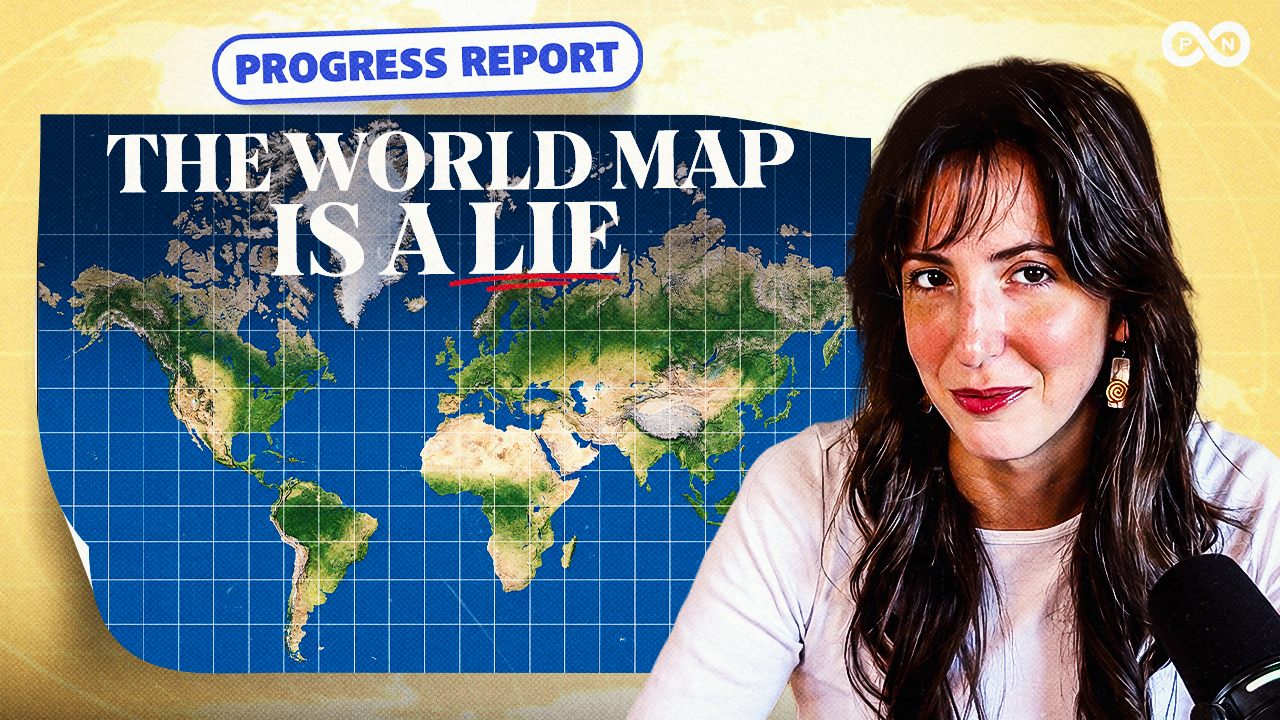
The World Map You Grew Up With Is Wrong
Featuring Emma Varvaloucas
Maps have distorted the true size of the African continent for 500 years, but a new UN resolution is changing that. Progress Network Executive Director Emma Varvaloucas examines this historic shift toward a more accurate projection to correct centuries of cartographic bias. Plus: a biological breakthrough that could prevent premature births, and the wild story of how Neptune was discovered 175 years ago.


Prefer to read? Check out the Audio Transcript
Although the transcription is largely accurate, in some cases it may be incomplete or inaccurate due to inaudible passages or transcription software errors.
Emma Varvaloucas: Do you actually know what the world looks like, or have maps been lying to you your entire life? That’s our main story on today’s episode of the What Could Go Right? Progress Report. And stick around, because we’re also talking about a scientific breakthrough that could stop premature births, and the discovery of a very blue planet.
If you’re new here, hey, my name is Emma Varvaloucas, and I’m the executive director of the Progress Network. Let’s get into it. You’re back in middle school. Sorry. You’re sitting in Ms. McGonagle’s social studies class, and everything smells like dusty books and cheap body sprays that barely mask the grossness of puberty.
McGonagle is going over the world map because all 20 of you have a test on country names this Friday. Right now she’s pointing to Ghana, and you notice how the continent of Africa looks about the same size as Greenland. Man, Greenland must be huge. Then Bobby hits you in the back of the head with a paper ball.
Now that you’re an adult, do you still think that Greenland is the same size as Africa? You shouldn’t. The continent of Africa is 14 times bigger than the country of Greenland. But it makes sense for you to get that wrong, because that’s what many of us were indirectly taught our whole lives through inaccurate maps.
So how did we all develop the same massive misunderstanding about our own planet? It’s all thanks to one of the most popular classroom maps in the world. In 1569, a mapmaker named Gerardus Mercator needed to make a map to help sailors navigate. But, like a sailor without a map, turning a 3D circular globe into a 2D flat map presents challenges that he didn’t navigate too well.
Or did he? Mercator’s map is meant to fix a specific problem for sailors. The straight lines on his map align with constant compass directions that sailors use to plot their courses. The Mercator projection preserves direction but distorts the size of land masses. The closer a country is to the poles on the map, the more their size is inflated.
That’s why Greenland looks like it’s been going to the gym when it should look like Africa’s much younger little cousin. It was never meant to be a map for classrooms, just sailors, and yet it’s been hanging around for literally hundreds of years. Earlier this month, the United Nations said, “We gotta fix this,” and adopted a non-binding resolution to encourage schools, governments, international organizations, and technology companies to replace the Mercator projection with more visually accurate maps.
You might be thinking, “Okay, big deal. Some countries are the wrong size. Why does the United Nations care this much? And why should I care? I don’t navigate a boat for a living or make land surveys.” Well And I’m gonna hold your hand when I say this, the widespread use of the Mercator map may be a little racist.
For almost 500 years, the standard map in classrooms around the world has shown the Western world, aka predominantly white countries, as larger, and much of the non-white world, particularly Africa, as smaller, and Europe usually appears directly in the center of the map. Critics of the Mercator say that maps have the ability to shape how power is perceived.
Togo’s foreign minister, Robert Dussey, said, quote, “Maps shape our understanding of the world. They guide education, nourish the imagination, and influence collective perceptions.” The Mercator map visually cues the idea that European countries are superior, and it gets even messier when you get into the history of some of those European countries colonizing some of those African and South Asian countries.
Not a great look. Whether signaling European superiority was the original intent or not, people are tired of this Eurocentric view of the world. That’s why the African country of Togo proposed the Correct The Map resolution to the UN. So what maps should we be using instead? Look, since the world is round, you can’t have a 2D flat map that will perfectly show land sizes.
Do not bring any flat Earth or nonsense over here. Wrong podcast. However, the UN suggests using maps like the Equal Earth projection that do a much better job with minimizing distortion and making Africa, and everything else, correctly proportioned. Equal Earth isn’t the first time experts have tried to make better maps.
In 2017, the Gall-Peters map picked up some steam in American school districts because it focuses on getting the size of the continents right. This map was designed by German historian Arno Peters in the early 1970s. His map is a rectangle, and it’s based on work by the Scottish mapmaker James Gall from 1855.
Although it’s better than Mercator’s map when comparing the size of the continents, there are some problems with the Peters one too. Similar to the way I feel after an aggressive Pilates class, on the Peters projection, polar regions are squished, and places near the equator are stretched in a bad way.
The Peters map does fix the Greenland-Africa size issue, but other places, like Russia, look way smaller than they are, and it’s a bad idea to use this map for navigation, unless you wanna write an epic memoir about being lost at sea. And in 2018, the same year that the Equal Earth map was released, Google Maps replaced the Mercator with an interactive 3D globe on its desktop view.
So we’ve been slowly moving away from the Mercator for a while, and now we’ve finally arrived at this historic moment. Togo, building on a campaign backed by the African Union, told the UN that it’s time to stop making Africa too small. This is a big deal because it’s an African-led effort, not a European one, and it was originally started by two African advocacy organizations.
It’s even the first time the African Union has taken an official position on how the continent is visually represented. From the beginning of this campaign to the resolution being passed was only 17 months. That’s speedy, especially in international affairs land. The UN’s new hero map, Equal Earth, was developed by cartographers, people whose entire job is the art, science, and technology of making maps, and was inspired by the 1963 Robinson map that shows the entire world at once.
Since its release, the reception has been mostly positive. However, not everyone is super jazzed about it, and just like that time a food fight broke out in the cafeteria during lunch, a few countries have beef. Let’s start with Ukraine. They abstained from the UN vote because the country says that the Equal Earth map displays the Crimean Peninsula, which is currently occupied by Russia, in a different color than mainland Ukraine, possibly implying that it isn’t a part of Ukraine.
As we know, Russia illegally invaded and took control of the Crimean Peninsula in February 2014. Japan did vote in favor of the new map, but they also have problems with Russia. Is Russia the Tom Sandoval of the world? Anyway, the Equal Earth map uses similar shades for Russian territory as it does for the Kuril Islands, and those two have been fighting over those islands since World War II.
The map got a yes from India as well, but Indian officials said that its border territories, long a dispute between them and Pakistan, must be depicted on the Equal Earth map the way India does on its official map. And last but not least, we have the one and only country who voted no on the UN resolution to adopt a new map.
Can you guess which country it is? The United States. That’s right. We want our maps to stay exactly the same. Well, sometimes. US State Department representative Yurena Farencovich said the map resolution, quote, “mocks the work and purpose of this institution.” She said that the UN would rather debate maps from the 16th century than focus on, quote, “genuine problems.”
Yikes. That seems like an odd statement when President Trump’s new favorite hobby seems to be renaming bodies of water on maps. And I’d like to remind you of something else. A big reason there’s a push for a new world map is that Greenland should never have been the same size as Africa. In 2022, Trump told reporters, quote, “I always said, ‘Look at the size of Greenland. It’s massive.’ That should be part of the United States.” You gotta wonder if he had a certain old map in mind when he said it.
Next, here are some numbers that will make you smile. Seven million, the estimated number of lives a blockbuster new tuberculosis vaccine could save by 2050. 50 million, the number of homes US solar capacity can now power. And 230,000, the number of students pursuing higher education in Zambia. It’s doubled since 2019.
And now, here’s some hopeful news about the cutest of human beings, babies. Well, we’re actually gonna talk about babies and their moms. Soon-to-be parents do a lot of wondering. They wonder who the baby will look like, they wonder if the baby will be a good sleeper, and they wonder whether their delivery date will be accurate at all.
The due date is a very educated guess by a doctor about when a pregnant woman will go into labor. Doctors estimate a woman’s due date by counting 40 weeks from her last period and looking at the baby’s size on an ultrasound. But these dates can vary by weeks and- They can be wrong. There is probably nothing more terrifying than going to pick out radishes at the grocery store and suddenly going into labor earlier than you were supposed to.
One of the reasons that delivery dates aren’t more accurate, and this surprised me when I learned it, is that we’ve never figured out the biological triggers that cause the human body to go into active labor. However, that could be changing very soon. Researchers have found that immune cells flooding into the uterus may be what starts childbirth.
Before I get into how they figured this all out, let me tell you why this is so important. Understanding what kick-starts labor can give doctors the tools to prevent premature birth, which is a birth before 37 weeks. Babies born premature may not have fully developed organs, and it increases the chances of conditions like cerebral palsy, intellectual disability, asthma, vision issues, and hearing problems.
So finding a way to keep these babies inside their moms for at least 37 weeks is potentially life-changing and even life-saving for these newborns. So how did scientists figure this out? A few years ago, researchers found that the human uterus releases molecules into the bloodstream at the end of pregnancy.
These carry immune cells called monocytes from the blood into the uterus. The monocytes build up in the muscle tissue and transform into another type of immune cell called macrophages. In this most recent study, researchers really dove into the macrophages and found that they grow tubes that attach into the muscle cells of the uterus and get to work.
It kind of sounds like a spaceship docking in a sci-fi movie. When the tubes are attached, they pump the muscle cells with mitochondria, most likely to give the muscles energy to push that baby out. It also increases the level of an enzyme that breaks down the hormone progesterone. So the new results suggest that human labor is started by a drop of progesterone in the muscle cells of the uterus.
But what if we could stop that drop? Researchers have already developed a drug designed to stop this process, and they’ve tested on macaques, and it worked. Another study is looking at the possibility of simple blood tests to determine more accurately which pregnancies are at risk of early labor. All promising good news, but we will have to wait and see.
And now it’s time for this week in history with a positive story from the past. It’s 1846. Specifically the night of September 23rd going into the 24th. You’re surrounded by men in black Victorian suits. Some look up at the sky. Others scribble math equations, and one guy looks through a telescope.
Someone yells something like, “Huzzah, we found it.” That was probably a fashionable thing to yell back then. I’m not quite sure, but we’re gonna go with it. What did they find? The new planet of Neptune, the eighth planet. Grown men clap each other on the back, and a slow tear rolls down the main astronomer’s face.
So that’s a great scene in a potential Hollywood movie about a big scientific discovery. Timothee Chalamet could play the new young astronomer who was mentored by George Clooney. However, that’s probably not how the discovery of Neptune really went. In real life, it was more like a long-distance group project that took forever.
It all starts- With Uranus. No, this is not a joke from an Austin Powers movie. Although perhaps we are still stuck in the middle school analogy from the first story. In 1781, Uranus was discovered, becoming our seventh planet. Astronomers like to watch, and they kept watching Uranus to see if they could learn anything else.
Eventually, they noticed irregularities in the way it circled the sun that Newton’s law of gravity couldn’t explain. As you may recall, Newton was the guy who figured out gravity after watching an apple fall from a tree. Anyway, these astronomers started thinking that Uranus’ weird orbit could be caused by the gravity of an unknown planet pulling on it.
In 1845, decades after the Uranus discovery, two guys were doing planetary math, or whatever you would call it, in two separate countries. Urbain Jean Joseph Le Verrier was in Paris, France, and John Couch Adams was in Cambridge, England. They were both independently going after the same challenge: calculating the position of Uranus.
Essentially, when they got dialed in on predicting Uranus’ position accurately, they knew that the new planet would be close by. This whole thing would be relatively quick with modern computers, but back then, it took a lot of work. That ability to predict the position of Uranus, verified by both Le Verrier and Adams, set up a third astronomer for a big blue observation.
On that fateful night in September 1846, Johann Gottfried Galle used Le Verrier’s calculations to figure out where the planet affecting Uranus would be in the sky. He fired up his telescope at the Berlin Observatory and huzzah, he found Neptune. Well, at the time, it didn’t have a name, but later it was named Neptune after the Roman god of the sea for its blue color.
What’s cool about it is that it’s the first planet discovered via mathematical calculation instead of just direct observation. It turns out the group project goes even further back. Historians believe that several astronomers did see Neptune but didn’t realize that it was a planet. Galileo Galilei, considered the father of modern science, saw Neptune all the way back in 1612 but didn’t realize it was a planet because it was so slow.
Neptune never gets picked for kickball. The discovery of Neptune 175 years ago has led to some pretty cool images and additional discoveries. In 1977, NASA’s unmanned spacecraft Voyager 2 left Earth and got close to Neptune by 1989. Yep, it took more than a decade to get out there. Space is real big. Not that you would know it if Mercator made a map out of it.
For four months, Voyager 2 took 9,000 photographs of Neptune and discovered some of its additional moons. Four months is a crazy long photo shoot, but maybe after being unknown for so long, the pretty blue planet likes the attention. Neptune has also been photographed more recently by NASA’s Hubble telescope in 2009.
Anyway, Neptune’s photos have come up even more recently with TikTok influencers. There’s a debate about whether Neptune is a lonely and depressed planet or not. We’ll let you weigh in in the comments. I hope these stories remind you that there’s so much good in the world, so it’s important to shift our focus away from all the bad sometimes.
Send this episode to your friend who was really excited to go see Macklemore and Ed Sheeran. Make sure to subscribe to our YouTube channel. We release 60-second good news stories daily. See you next week.
.
LOAD MORE
Meet the Hosts

Emma Varvaloucas